About this site
How did this site come to be?
I reserved this domain (lorenzobartolini.me) last december, seeing as the .it and .com domain were both already taken, and I was worried I'd be left without an available domain. Back then I didn't really have any ideas on what to do with it, but I was confident it would end up useful eventually.
So come this winter, I wanted to find a place to both show off all the cool tricks I learn and write short blog stories talking about my experiences. I remembered I had this site, that I only had been using to test npm packages in a production setting, and I decided to do something with it.
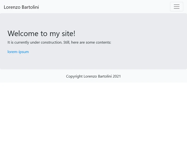
Here's how it looked back then:
The concept
Ok, the website had to have a few features:
- be a tech showcase
- have a simple design
- be a place where I can write about some new tech I just found out, or a recent happening
- be fun to create!
The tech
The base architecture is based on this video from youtube creator Ben Awad. It utilized nextjs' SSG (Static Site Generation) to dynamically create pages based on markdown files present on a folder in the project structure. You're reading a Markdown file right now!
For the background, which was the fun part of the project, I wanted to build something with threejs. Looking around I found that the smartest way to go about doing it looked like using react-three-fiber, a React renderer fot threejs scenes. And I was stunned! Building a 3d scene looked as simple as building ah html (actually jsx 😉) page!
The design
So, I am not a designer. From the get go, I knew that if I wanted to build something nice, I had to keep it simple (hence the second point in the features list). The first decision was on the typography: I went about tackling this task through the old art of taking inspiration from somone else's work.
I settled on a sans-serif default system font for the paragraph was a good idea, as it will blend in with what the user is used to seeing, and will also help load the page faster, and Rubik for the titles. It looked really nice, expecialy with the orange theme that I had decided on.

Fun fact: the precise color (#FFA500) was chosen because I grew fond of the default CSS "orange" color, that I was using for testing.
Deep dive: the background
I knew what I wanted to do with the background: it had to be a solid color, interrupted by floating objects. So the first step was to build one.
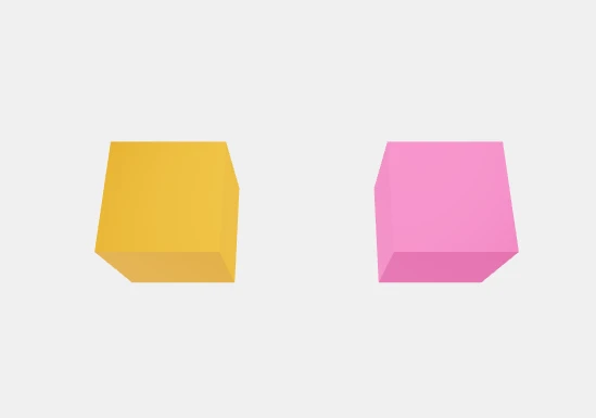
I starded by CTRL-C CTRL-Ving the sample react-three-fiber project, and started playing with ways to move the objects. Soon I had a cube following the mouse pointer!
That evolved when I found that react-three-fiber had a companion animation library, based on react-spring. It looked like I found what I was looking for: objects that followed the mouse pointer in a way that looked like natural movement.
type FollowerProps = {
    target: { x: number, y: number },
    tension: number,
    friction: number,
    children?: any
}

const Follower = ({ target, tension, friction, children }: FollowerProps) => {
    const { boxPosition } = useSpring({
        boxPosition: [target.x, target.y, 0],
        config: { tension, friction },
    })
    return <animated.group
        position={boxPosition}
    >
        {children}
    </animated.group >
}
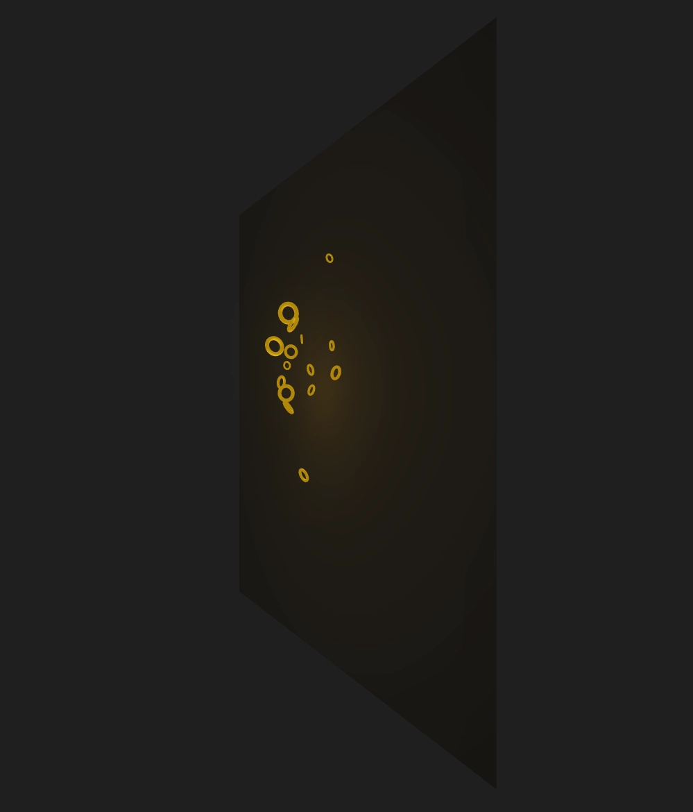
Now for a bit of trickery: the orange halo that moves around the rings in the background is actually a point light, illuminating a plane placed behind it. Here's a side view:
Can I steal your code?
Yes! If you want, you can head to the repository, clone it, and play around with it if you want. You might find some differences from what I've written in this article, as I continue to tweak and change the appearance and content of the site.